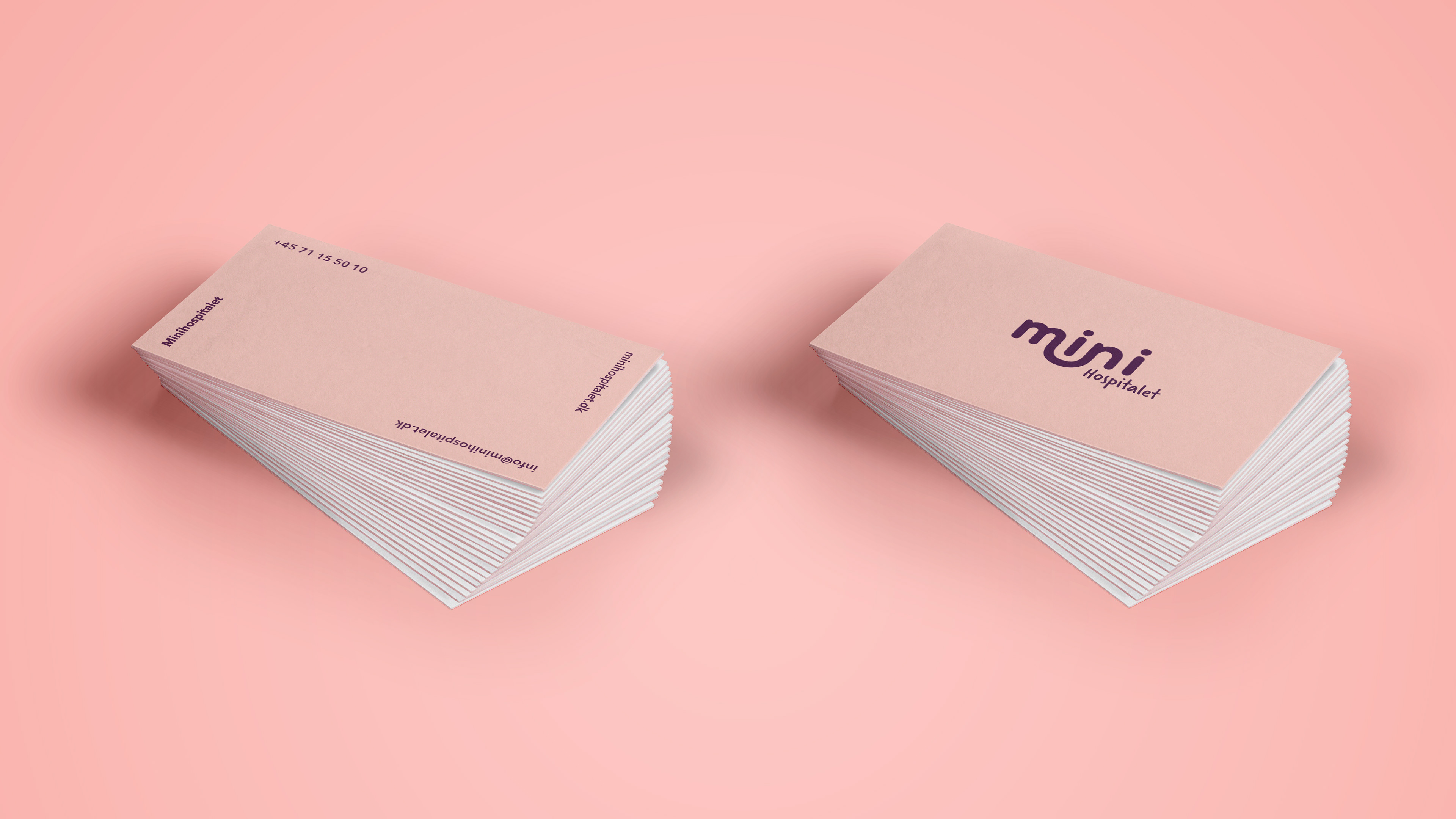
Minihospitalet
- 2019
MiniHospitalet is a truly inspiring and touching initiative. It was founded by two parents, who saw the opportunity to help children who has an illness or has special needs, to have a better life, through playing with toys related to the medical world. Just to make everything a bit more normal, in a world filled with hospital visits.
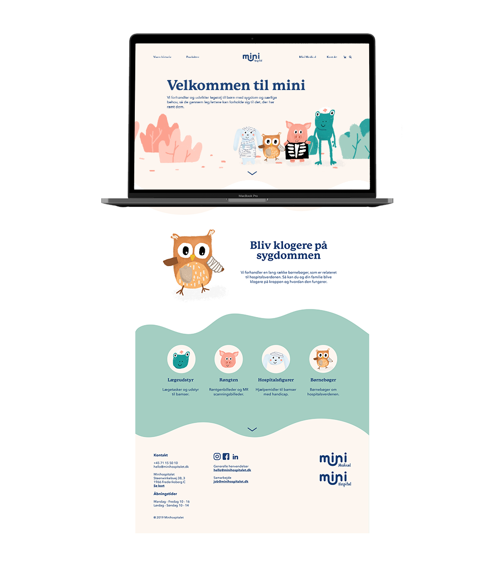
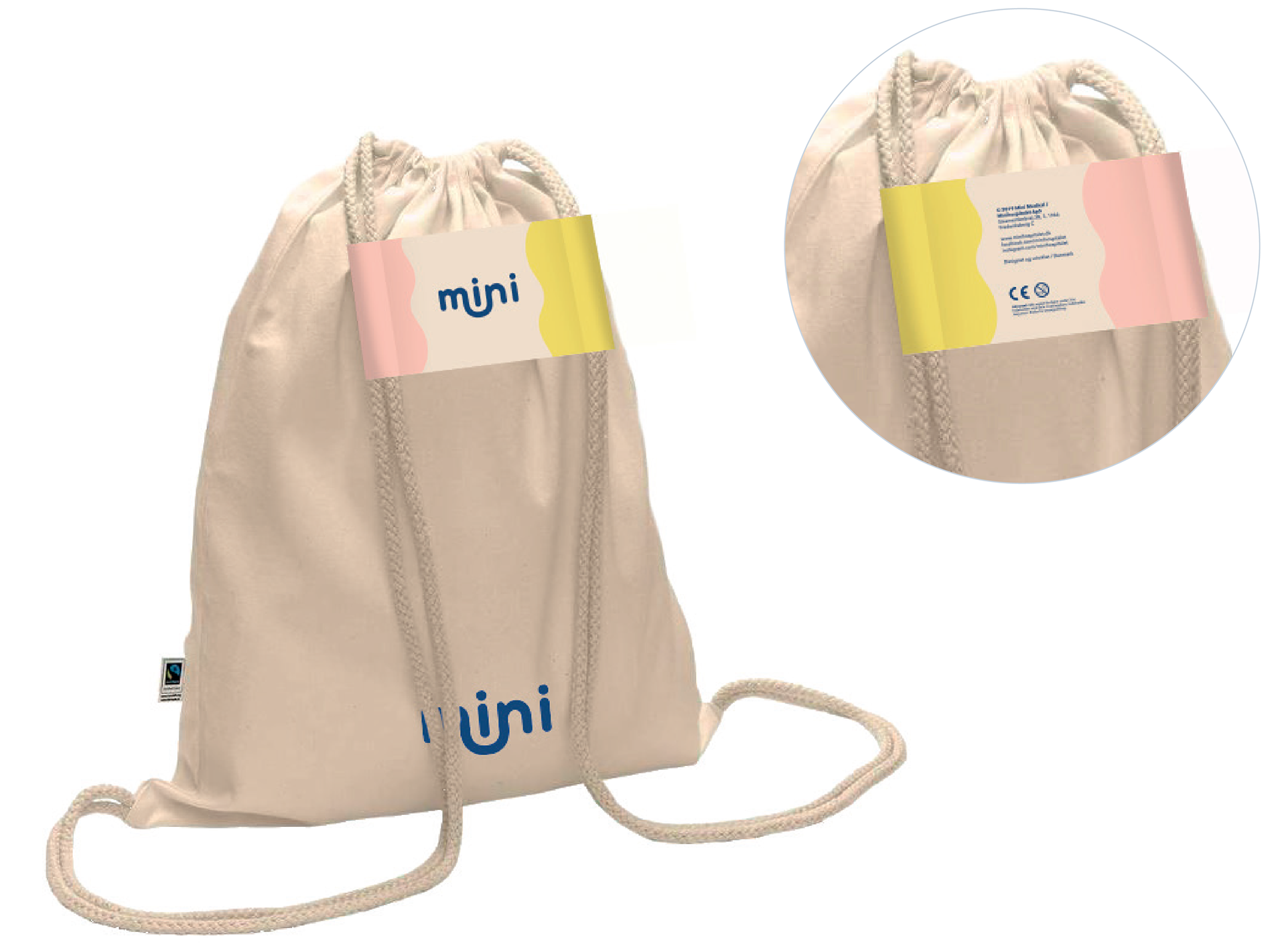
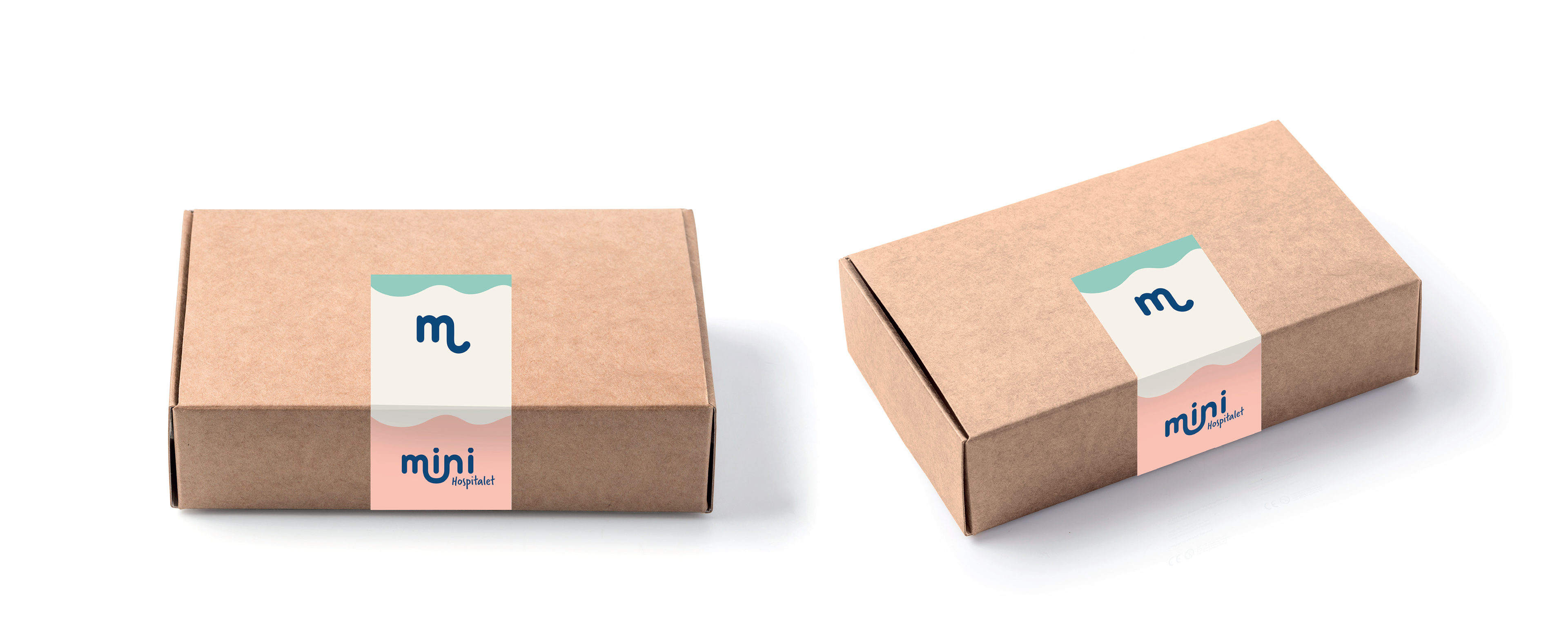
The goal of the new identity was to make the start-up more professional, and still have the personal touch. The concept behind the new logo is “connection”, hence the literal connection between m and n.
The word “connection” has a power to it, that relates to the goal of the company itself. To connect children with family, with friends, with the world.
The illustrations was made by hand to give it a friendly feeling. They are all ill with some kind of disability, to show that it is completely normal, which has the goal to remind the children that it everything and nothing is normal. That not every teddy bear has both arms.
The new visual style was applied to the new website: www.minihospitalet.dk
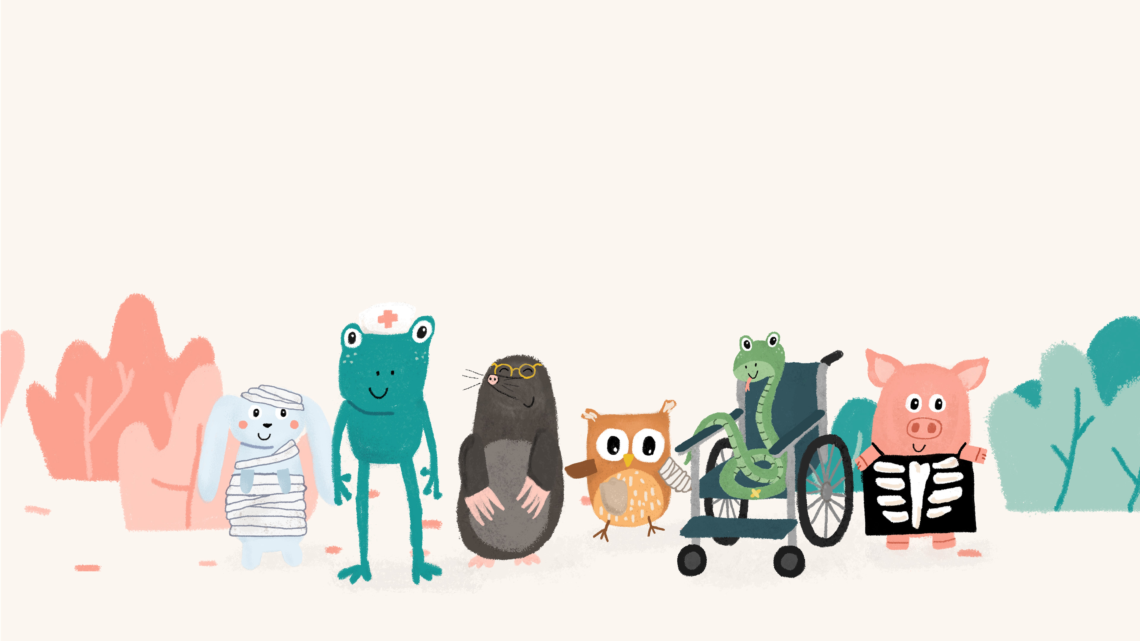
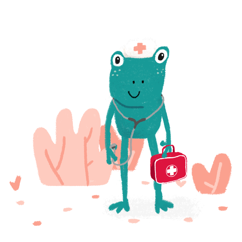
The illustration each has their own challenges. The frog is the doctor, and is supposed to be the main character. The characters are all animal, to make them more interesting for the children.
Each illustration is assigned to a topic on the webshop. For example, the owl is a symbol of wisdom, and is therefore the head of childrens books. The hurt bunny is head of dolls and other figures, and so on.
In the future, the concept could be broadened out and the characters should have their own story told in a childrens book.